Township of Manitouwadge - Rebranding
Consultation has concluded
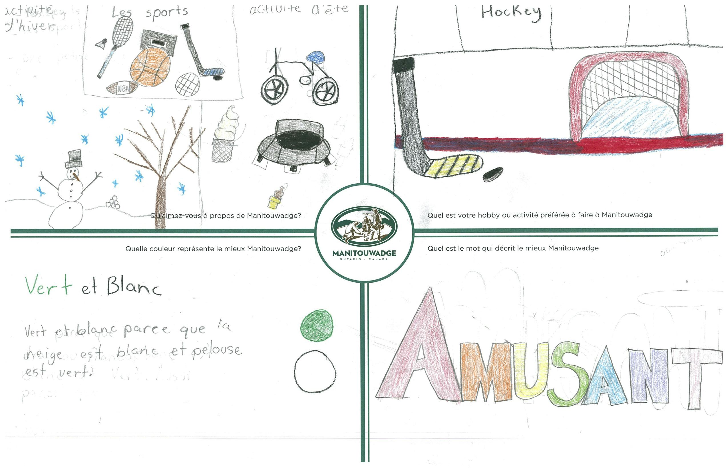
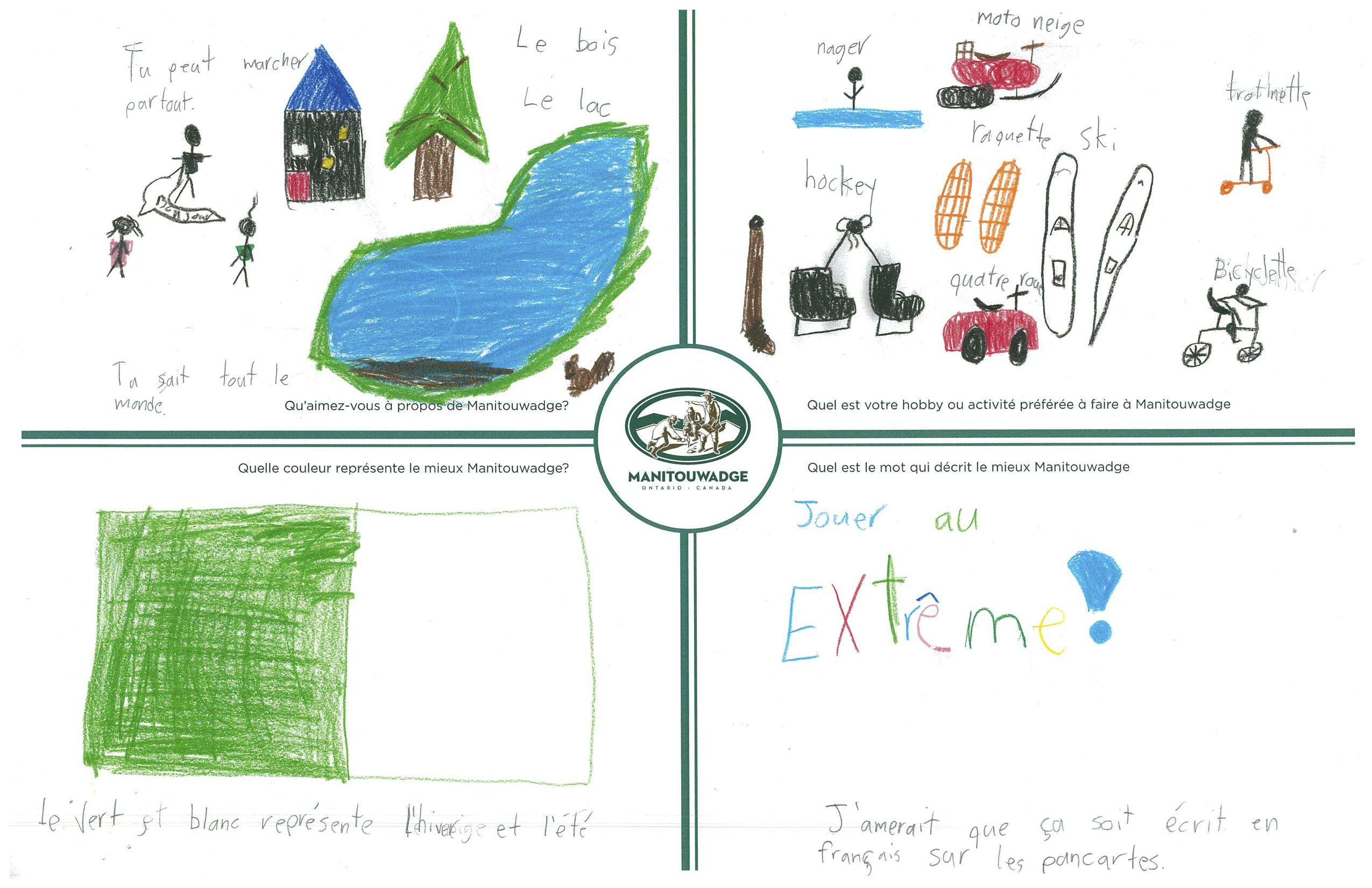
A logo is a symbol of what a community stands for, its values and its unique attributes. It is a representation of the physical, personality, experiential and emotional elements of a community. The current Manitouwadge logo was developed in 1960 and was a symbol of the community at that time – Manitouwadge was a newly founded municipality with strength in mineral exploration and mining.
As we work to market Manitouwadge to new residents, businesses and investors in 2020, we must pause and ask ourselves if the Manitouwadge brand accurately portrays what we stand for today and what the community aspires to be in the future. Manitouwadge has clearly changed and evolved since 1960 and our brand must portray who we are and where we are growing for the future. This is not only a question for Council but also for the community.
In September 2019, staff proposed to Mayor and Council that the Township of Manitouwadge undertake a logo design process to include the following:
- Public consultation to seek input from the community about the current municipal logo;
- If the logo should be updated;
- The public’s opinion on the key features of Manitouwadge;
- Identification of the Town’s value proposition; and,
- To have a graphic design artist put the ideas captured from the public into a simple, easy to recognize corporate logo for the Township of Manitouwadge;
- Council, and the public, will be presented with design drafts to comment on. This feedback will further assist the graphic design artist to finetune the images.
To facilitate the rebranding process, Council appointed community members to a newly formed Community Revitalization Advisory Committee to oversee the process and provide recommendations to Council on the rebranding options.
After 6 months of consultation, research and brand development, the Community Revitalization Advisory Committee is ready to present a new brand option to the community and Council. Ultimately, Council will be tasked with approving, adopting and implementing a new municipal logo.
Over the course of four months, the Community Revitalization Advisory Committee was presented with 10 tagline options and 5 logo options to review and discuss. To see the options presented, please view the full reports in the Reports and Documents section on this page.
We invite you to vote for your preferred option below.
Who's Listening
-
Phone 807-826-3227 x 242 Email edo@manitouwadge.ca -
Phone 807-767-4443 x 222 Email stephanie@firedogpr.com